THE PROJECT
-
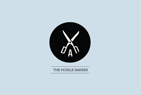
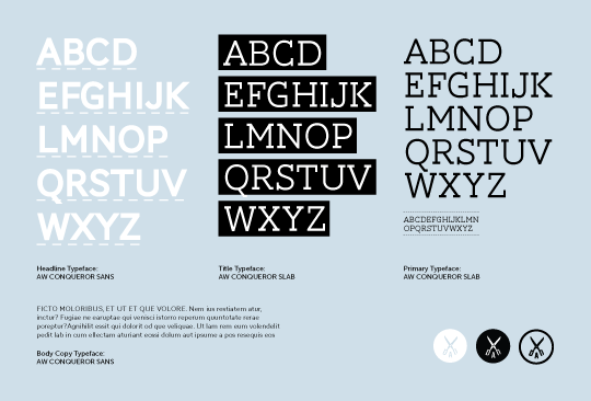
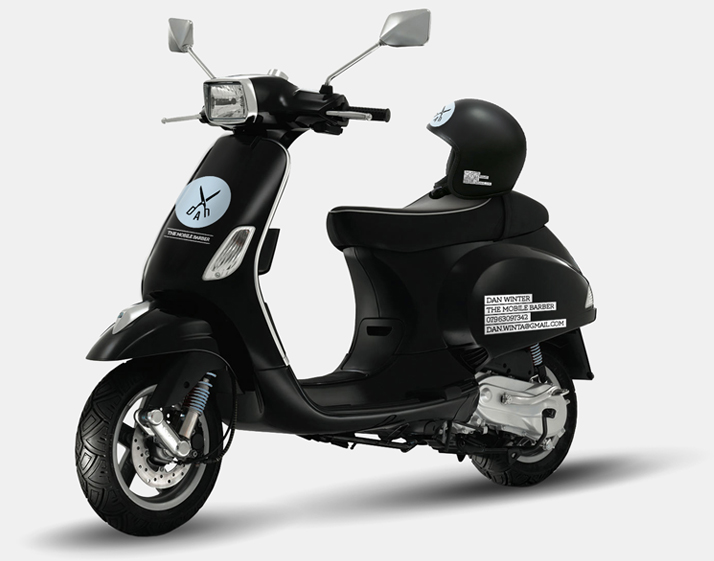
The brief was to design a logo and visual identity for a start-up mobile barbering business. As mobile barbering is not the norm I aimed to create an identity that was bold, to the point and unique in its market. Barbers traditionally use red and white stripes, to avoid cliches and produce something unique I used a limited and discreetly masculine colour palette of light blue and a contrasting black & white. The logo design incorporates Dan's name as part of an almost miltary styled scissor symbol. Whether people initially see the word 'DAN' in the logo or not the following strapline 'The Mobile Barber' clarifies the business name and service. The dashed line above and below the strapline echoes the dashed 'cut here' line normally found on print, and features throughout the identity to create a strong visual language to communicate with customers. As well as with the strapline, the symbol can be used on its own in 3 different styles for Dan's printed materials etc. Some information is highlighted using black bars which again reinforces the sense of masculinity throughout the brand.
Completed whilst working as BoyEnjoys.
SERVICES PROVIDED
-
Logo Design, Corporate Identity, Stationary Design, Brand Guidelines, Twitter Page Design, Vehicle Graphics
TESTIMONIAL
-
"I couldn't be more pleased with the finished product, I needed a logo design and branding for my start-up barbering business that shows I am professional and offer a unique service, and thats exactly what I got and more. Anton kept pushing for a solution that would stand out so people would take notice and my business has been very successful because of it"
-
Dan Winter


